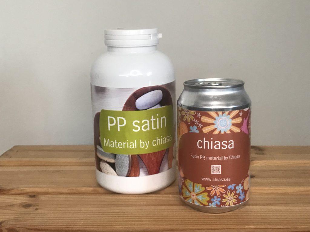
Satin PP is not a variant between gloss and matte, but rather a finish with its own visual and tactile properties. Its uniform texture eliminates the excessive reflections of gloss, but maintains the vividness of color that is sometimes dulled on matte surfaces. The result is a label that accompanies the product without detracting from it.
Why satin PP makes the difference
- Balanced color fidelity in inkjet
Unlike gloss, which can exaggerate contrasts, or matte, which tends to soften them, satin:
- maintains the original saturation of the design,
- preserves sharpness in lines and text,
- provides clearer reading in artificially lit environments.
Perfect for labels where aesthetics are part of the message.
- A more natural, less plastic-like visual finish
The satin finish gives a more organic feel.
It does not exaggerate the shine or dull the design: it presents it in its most authentic state.
This is key in products where the label must convey authenticity:
- natural cosmetics,
- craft beverages,
- premium or gourmet products.
- Best suited for curved or irregular surfaces
The satin finish reduces distortions and reflections that can cause glare on cylindrical or contoured containers.
The label blends in better with the container, maintaining a uniform appearance.
- Excellent performance in inkjet printing
The satin finish provides an ideal surface for inkjet ink:
- controlled absorption,
- consistent colors,
- precise definition in codes and graphic elements.
Where it works particularly well
Satin PP is an interesting solution in sectors where product design and perception are key:
- food and beverages,
- cosmetics and personal care,
- handcrafted or natural products,
- premium or high-quality visual labels.
A finish designed to highlight the design and complement the product, without exaggerating or taking a back seat.
More information about our PP supports here